Stripped back design puts the music centre stage
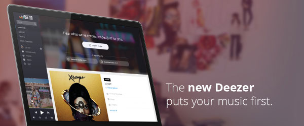
Deezer, the premier digital music streaming service, today announced the launch of its new look User Interface on web – a stripped back, smart design that puts music recommendation first.
Based on extensive usability testing and feedback from users of the service, the new design will showcase the breadth of its music catalogue (now over 35 million tracks), by giving the majority of the digital real-estate over to the content from artists – putting music recommendation and favourites firmly in the spotlight.
The new look also highlights Deezer’s intelligent ‘Flow’ function to further aid discovery and offer new music recommendations even more effectively, with just one simple click.
New design features include:
- A clean and refined look – inspired by uncluttered tablet design
- Removal of the header – highlighting ‘Flow’ and emphasising new music recommendations editorial content, album releases and playlist selections
- A new sidebar, giving you one-click access to your entire library and core features of the service
- Personalised welcome screens, contextualized with time-zone and location, most listened to tracks, genres, artists, playlist and radio suggestions based on mood and taste
- Increased interactivity through ‘Flow’ – users can now like and dislike tracks, helping refine algorithmic recommendations even further
Alexandre Croiseaux, VP Product, Deezer said: “Deezer has built a global audience of over 16 million people, so we have access to a huge amount of data, meaning we can adapt the service to the needs of our users. We believe our new design is truly smart, both in terms of form and functionality, and as a result we are putting the focus squarely on what matters the most – the music.”
Web users can switch to the new look Deezer from October 1st 2014.